Meat Processing Website Re-Design
We wanted: a really simple website that’s easy to use, fun to read, and most of all – easy to edit!
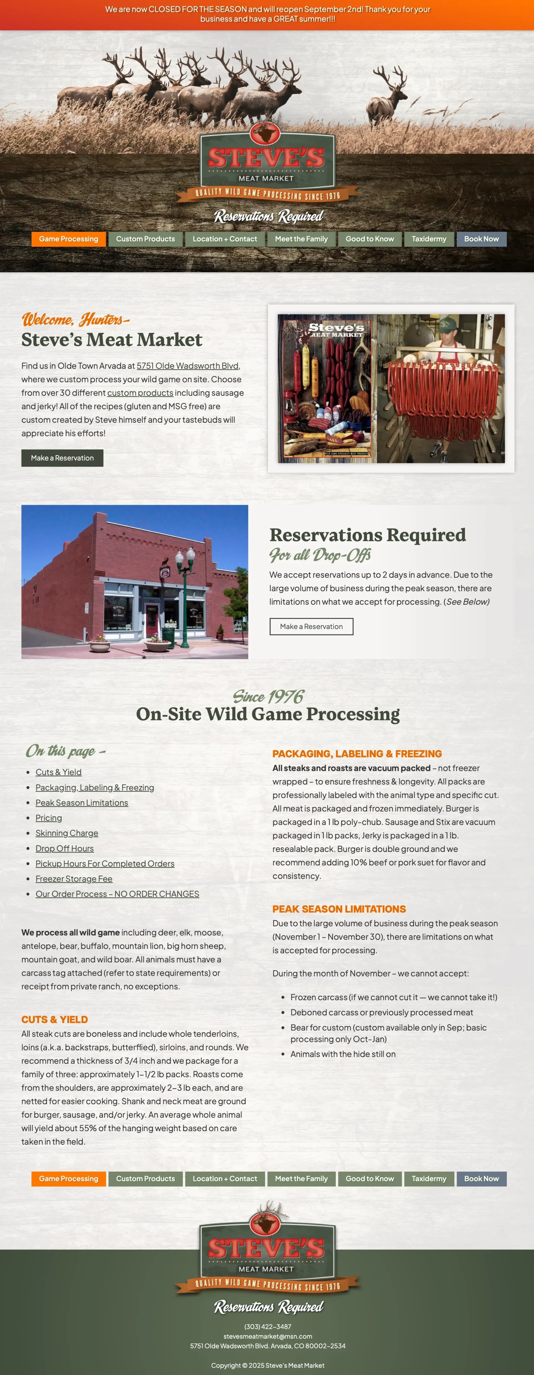
Leading with a wildlife photo not only connects with hunters but also helps to show what you do.
The top orange banner highlights updates and seasonal instructions, while the centered text draws the eye down to the logo. Our single-level (no drop-downs) navigation is button-based, to mimic the style and color of the logo, while the orange stands out as the current page.
We start with welcoming hunters and showing some meat! This format lets “people know they’re in the right place.” The rest of page is branded with a strong but simple color palette, accented with a script typeface for a slight retro feel, and has a light woodgrain background for texture.
We state the location and offer a “book now” button. We then remind them that reservations are required and a quick sentence about how it works… this page then goes right into game processing, so there’s no clicking or page-switching to get to the information that people need right away. Since the page is long, we have an automatic table of contents with links. A basic and straightforward 2-column layout gives everyone the feeling that they’re seeing everything they need to see in one single place. It also makes for really easy editing!
The custom products page has a familiar grid layout, showing the photo, product, price and description all together (instead of tabs and popups). I can also sort these automatically by title so it’s easy to skim and find something.
All of the colors, textures and photo treatments will be applied by the theme. The header image has no treatments but can be swapped out easily.