Healthcare Logo/Website Design
Just because it’s rough times or your last days, that doesn’t mean it will be your worst days…
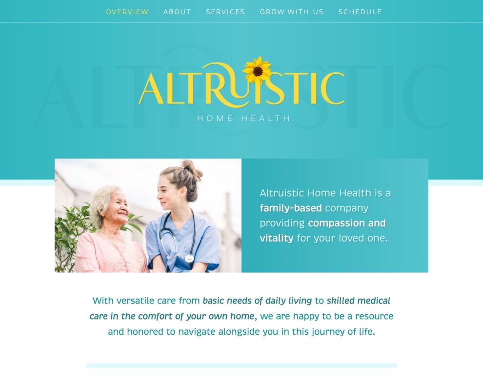
Using a teal, yellow and white color palette, we have a bright and happy overall look. Subtle layers, gradients and lines create depth without heaviness. The typefaces are full of character and detail and italics help add to the flowy, expressive feeling. The header features a strong and dominant logo that’s curvy and hinting at a yin-yang. The sunflower is growing and blossoming out of the words.
Overall the design is modern, simple and conversational, and while text-heavy is easy to skim. The photos help not only direct attention to headlines but also show that your clients are happy and well cared for.
