Similar Projects
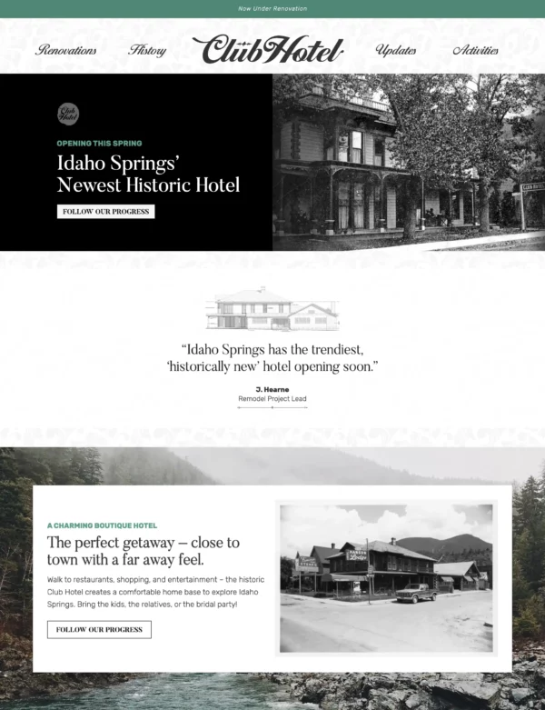
Boutique Hotel Branding
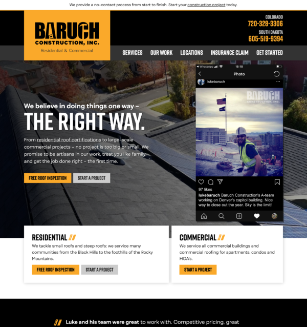
Residential and Commercial Roofing Website Design
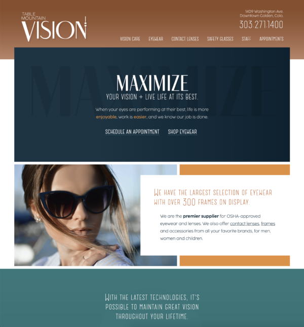
Local Optometry Website Design
Media Company Logo Design
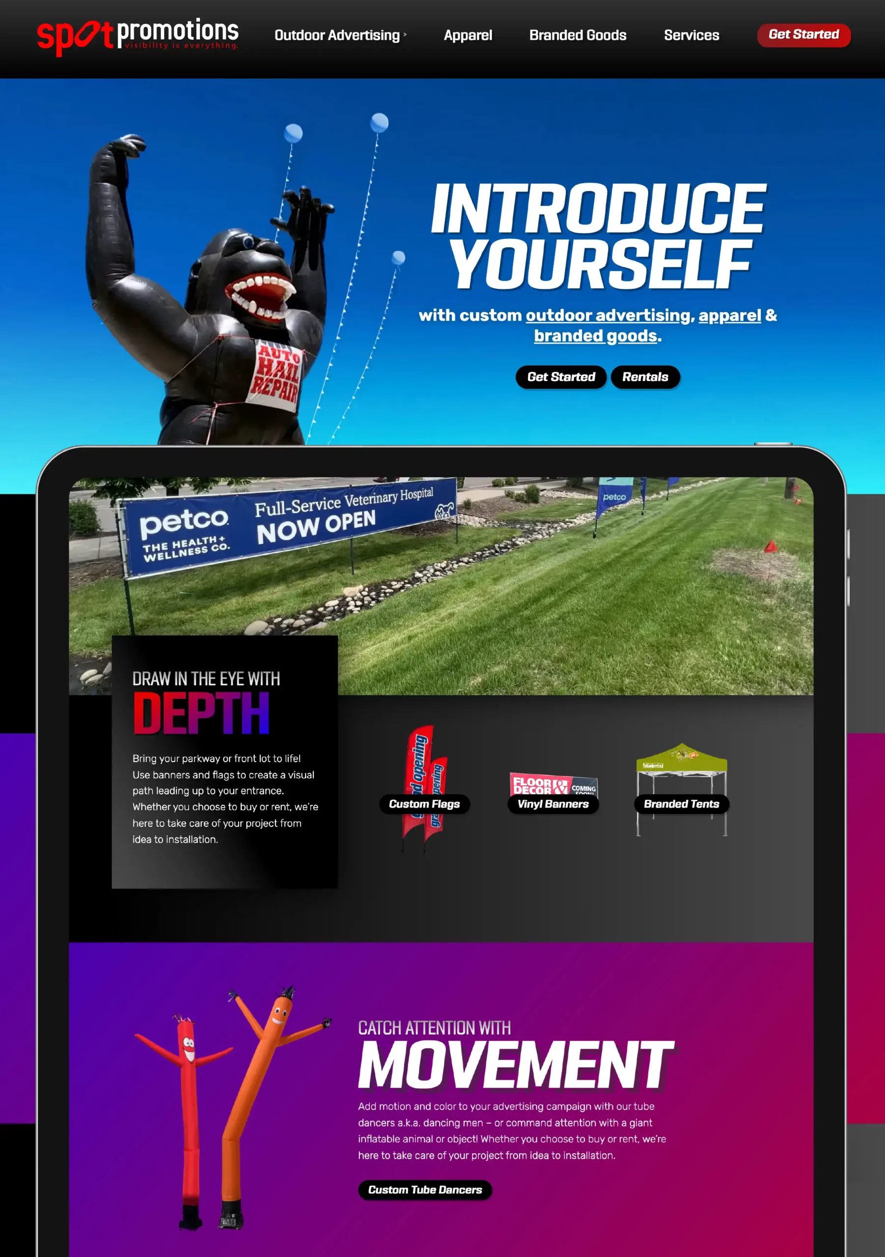
The typeface for the headlines has a geometric feel, like the logo. Intricate details, like in the ‘t’ and ‘r’ help to convey a custom feel. Its boldness feels solid and exciting at the same time, especially in the italics. I wanted interesting and unique typefaces with a good foundation – to hint at your services too. (If the gorilla falls over because you’re too creative with the installation, that’s a bad day!)
The big gorilla photo, layered with the cloudbusters and set on a sky-style gradient says “outdoor advertising” without having to read a single word. Since we do more than that, the text directs us to apparel and branded goods as well.
When we do get to the words, I thought “introduce yourself” was the perfect title for this beast! And stated simply, that’s more or less what’s happening with all advertising. Buttons act as call to actions for packages, quotes, or whatever we decide here.
Our next headline speaks to your tagline, and a few quick sentences further guide those who choose to read. For those that don’t, we have a clean and simple product grid. Transparent backgrounds help to create shapes for the eye to identify, as well as offering an opportunity for the user to picture some of these things together easily in their mind.
A big wide photo layout feels immersive, and creative. I have a super cool gradient headline with text, leading to the possible products that accomplish said headline. I’m also showing a not-full-width photo with the text on the opposite side, a single product, and then a wide photo without products. If you think of these each as “blocks” – these styles/layouts can be used and interchanged as needed.
The red and blue gradient on the text is not used often on the web, mostly because it’s challenging to code and works well in few instances. Well, I think this is one of those few instances! Combined with the grayscale gradient, we get a sense of depth and layering, along with a feeling of custom, creative and showy, possibly even over-the-top! It helps to tell your customers that you’ll go the extra mile to make sure their advertising hits the spot and shows off their branding well. Used sparingly of course, it hits the spot with the “dark mode” theme by bringing in pops of color and the feeling of motion.
For the tube dancers section, I’ve included a moving gradient, which can be seen on the live site. Words that we wanted to describe this design, in the scoping phase: fun, high-energy, inspiring, feeling of movement, exciting, eye-catching, layered, deep, professional, yet still creative and showy
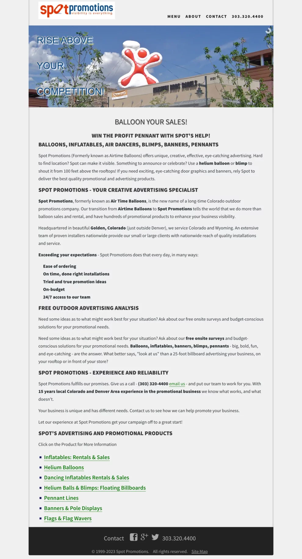
Website design before (below) and after (above):
She got down to business!