Similar Projects
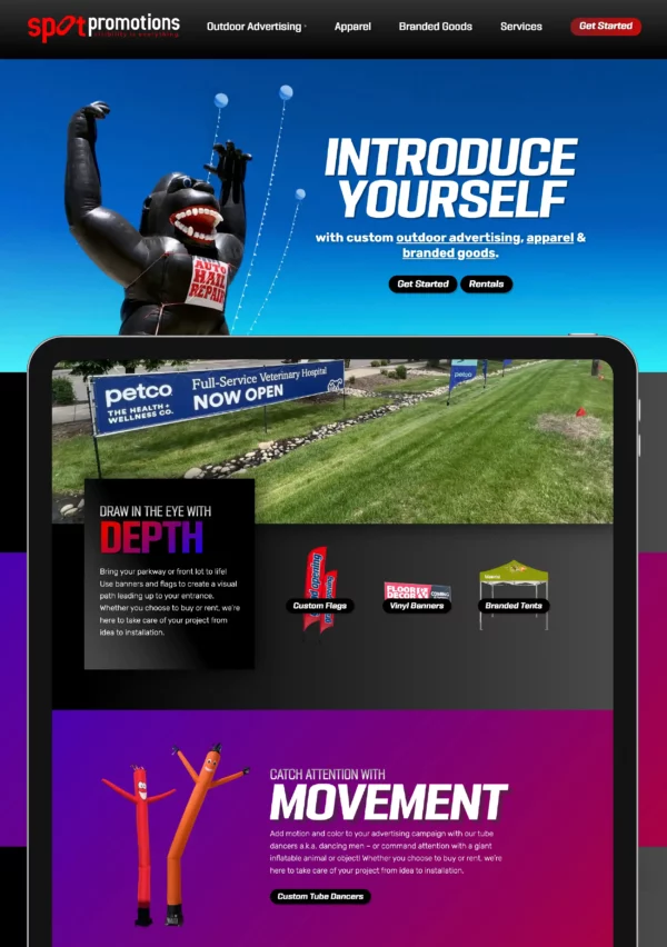
Outdoor Advertising Website Design and Branding
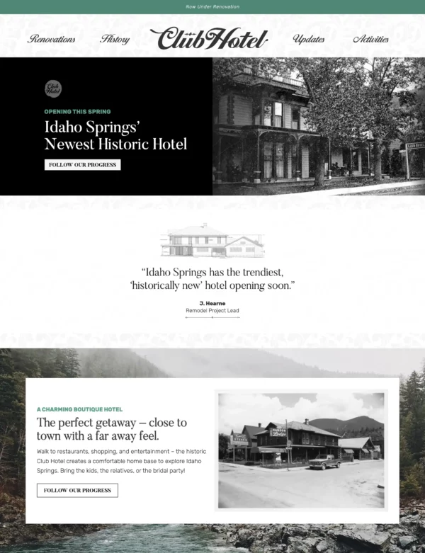
Boutique Hotel Branding
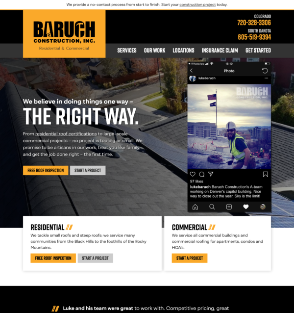
Residential and Commercial Roofing Website Design
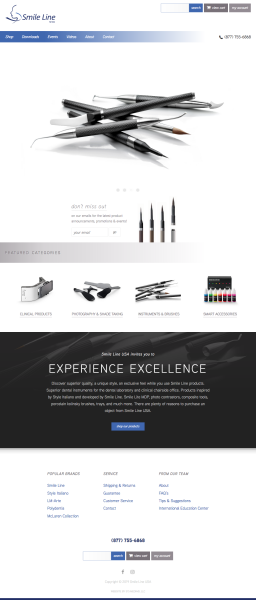
Dental Website Design
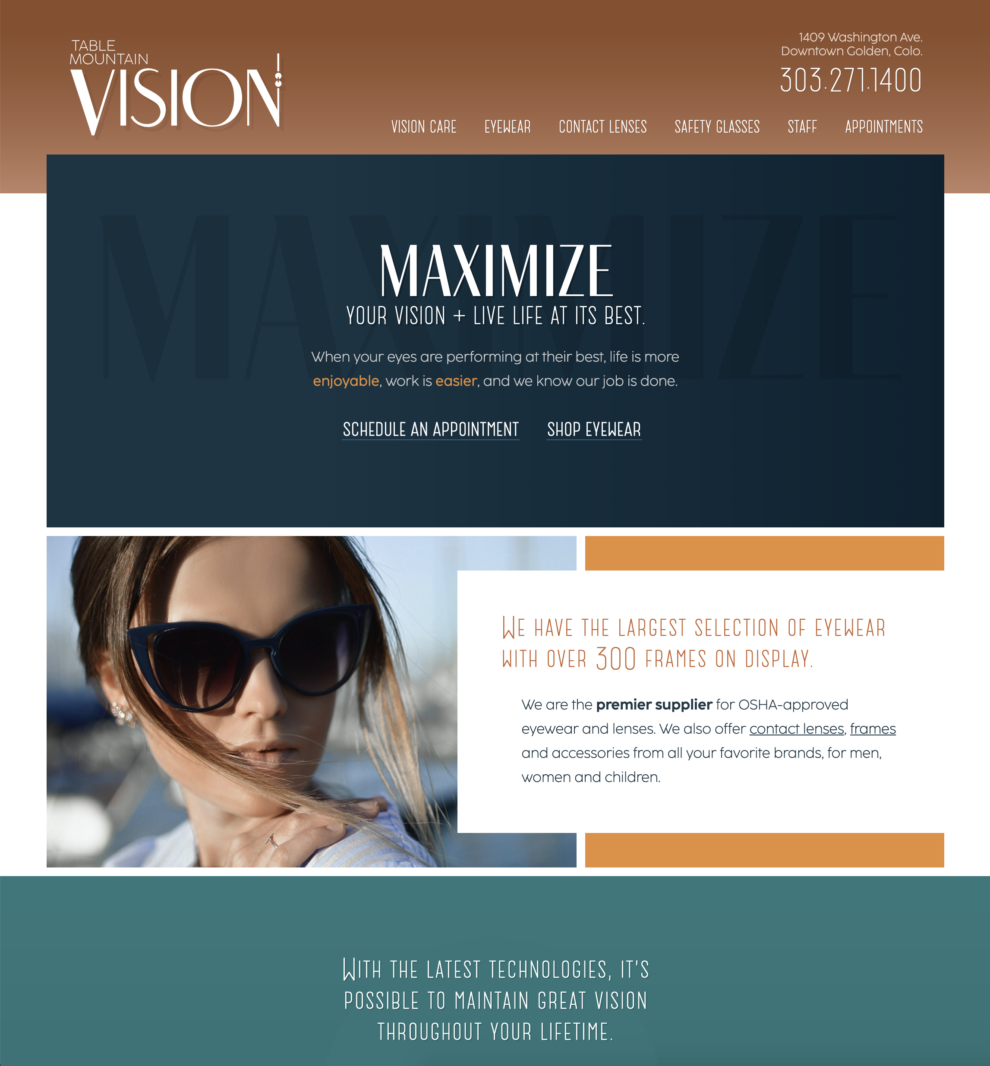
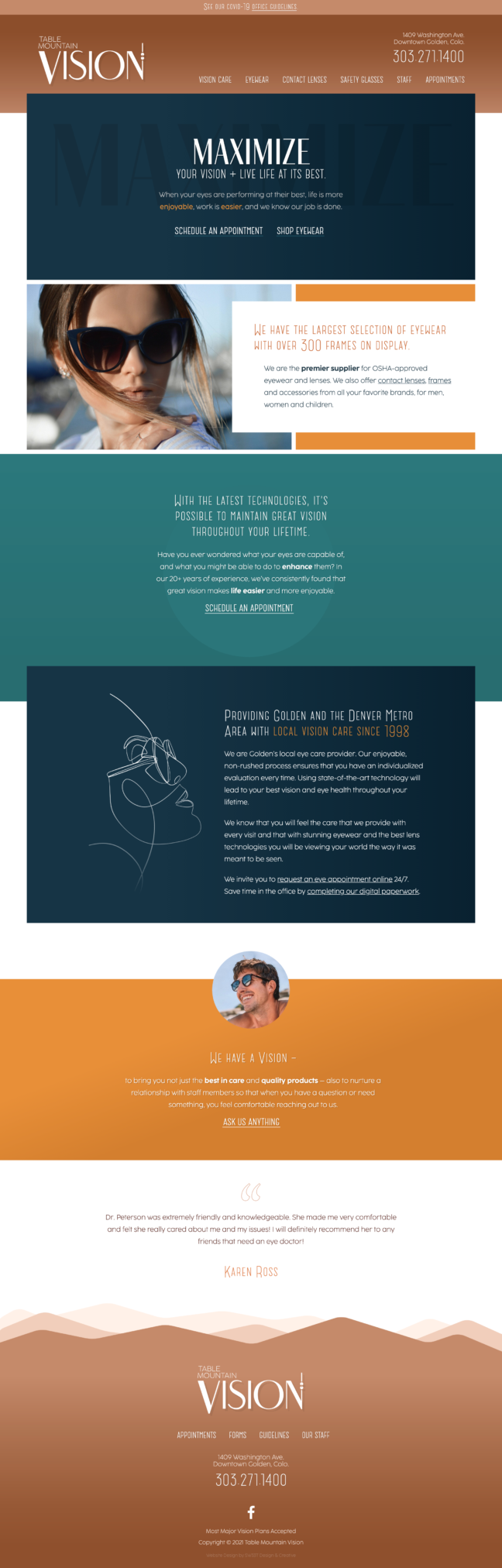
A look that’s modern, elevated, and young – yet timeless; show growing, living, moving forward; more inviting, with some vibrance; more personal than the big chains; overall simple and artsy but not overly stylish or overwhelming; focused on “how we see” and working to instantly communicate via our eyes.
Overall the design is simple but artsy, with a touch of mid-century modern and art deco, but not too stylish to be offensive. Its artistically inspired bold mountain silhouettes are interesting and reflective of Golden in their simplified forms. More classy than casual, more luxurious than the “big chains,” but not too much of either.
The headline font has a great mix of thin and thick lines, to set the tone for a “not your average optometrist.” The subheading and body fonts are legible and straightforward, with a few little touches to build some personality, like in the capital W. Simple CSS elements create depth and add very little to download time. Blocky, alternating branding colors are easy to reproduce for print, signs and social media.
My website is beautiful, simple and elegant, and I’m proud of it.