Similar Projects
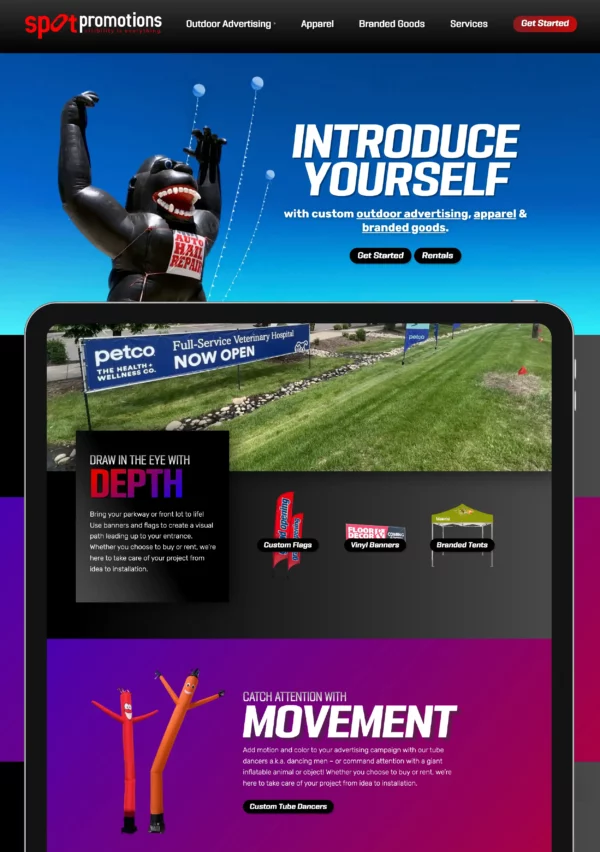
Outdoor Advertising Website Design and Branding
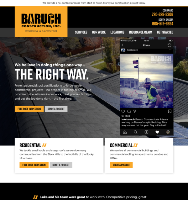
Residential and Commercial Roofing Website Design
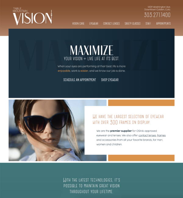
Local Optometry Website Design
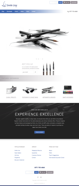
Dental Website Design
A style of script and patterns, combined with photography and color contrast, brings together both styles and says that this place is hip and cool – in an historic, interesting town, with lots to do. Headline fonts have tons of character with an olden feel that looks like they were photocopied. The body font is modern and trendy, yet with the same style of A’s and T’s so the combination feels like we’re bringing old and new together. There’s a constant play of styles, of serif and sans-serif, all to hint at the history while reminding people that it’s brand new.
How do you “sell” something that doesn’t exist yet? With a focus on branding, we build excitement with the remodel and the newness that the first guests will experience, combined with social proof, we sell walk-ability and the weather, then showcase local things to do – so that their trip feels planned before they even reserve a room. After all, that’s the hardest part of trip planning.
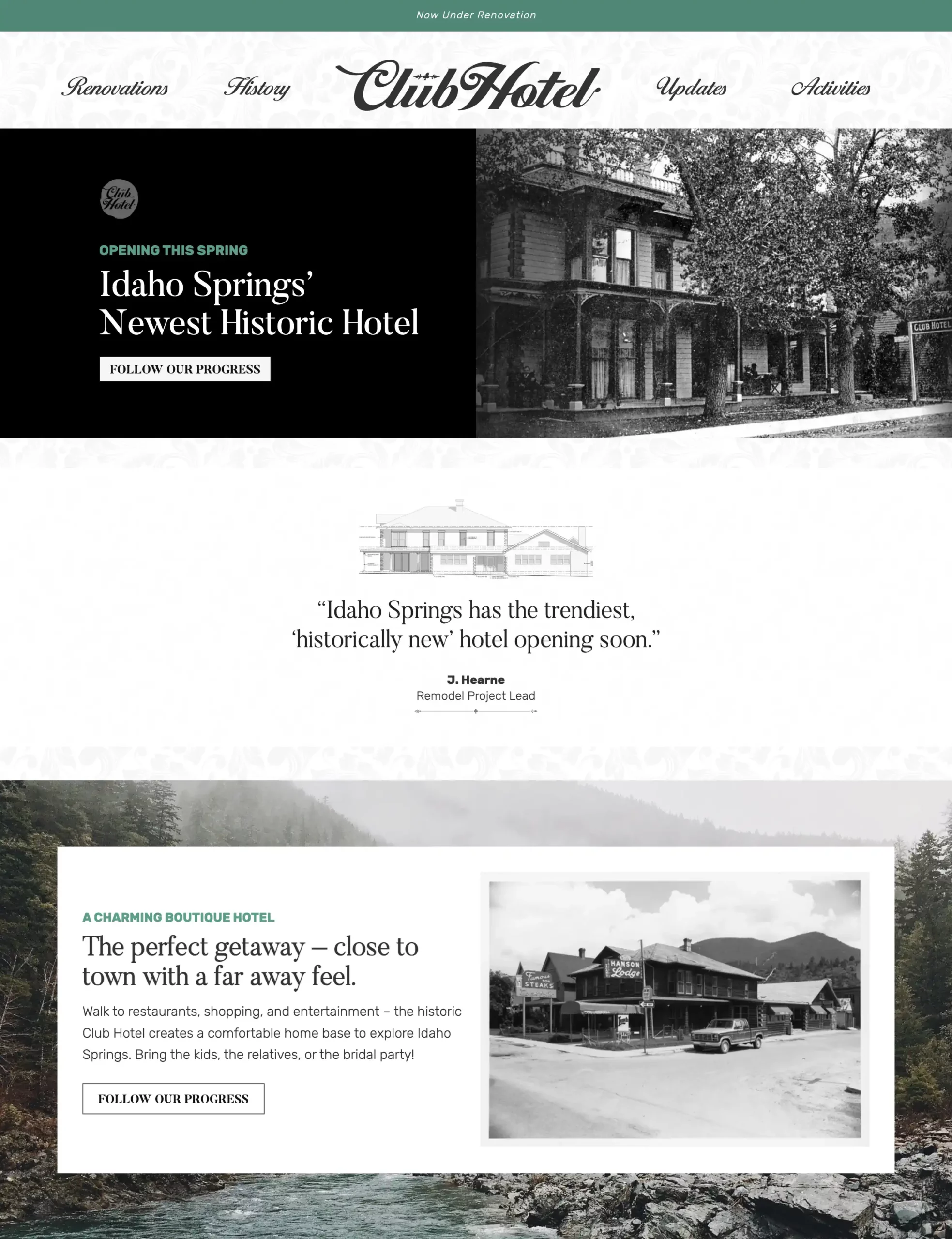
At the top, we have an alert bar that’s easily updated and attention-getting but not stealing the show. Keeping the navigation simple gives people less things to do, therefore making “reservations” (which goes to the rooms page) an obvious choice.
A damask pattern with low contrast creates a background pattern, breaking up the white space while still keeping legibility, and hinting at Victorian style without being too feminine or gaudy. We want guys to book this place, too!
The pitch opens with a historical photo, one that looks so historic that it’s clear that we’re selling an updated version of this building. Our call to action predicts an opening, states the location, and “follow our progress” will start growing an email list.
The architectural photo reinforces the idea that the building is under construction, and can showcase your dream/vision in quote form, to set the scene.
Again mixing old and new, I have a riverside shot behind the Hansons photo, showing off a far away feel as mentioned in the headline.
Changing over to white on black for a bit of a sporty, adventurous feel to attract the vacationers, the background font reminds me of the all-capital fonts at the bottom of old maps and photos. Photos showcase the three categories, while the text targets city millennials from Denver by telling them it’s cooler up here, and it’s a great place to bring your parents or cousins and show yourself off when they come to visit.
Heading back toward a Victorian look, the damask pattern has more contrast and is used as a border for the next section, which clearly states we are in the process of a remodel, in case they missed it earlier.
The footer brings back the teal accent and finishes with a repeat of the navigation. All photos can be easily changed as remodel progress continues.
Truly a God-send for our business!