Similar Projects
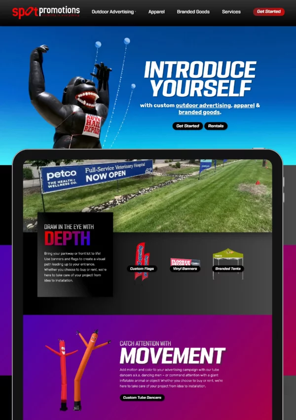
Outdoor Advertising Website Design and Branding
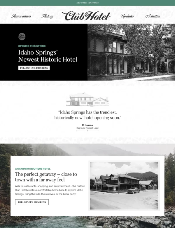
Boutique Hotel Branding
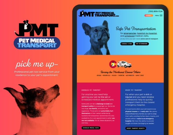
Pet Taxi Branding and Website
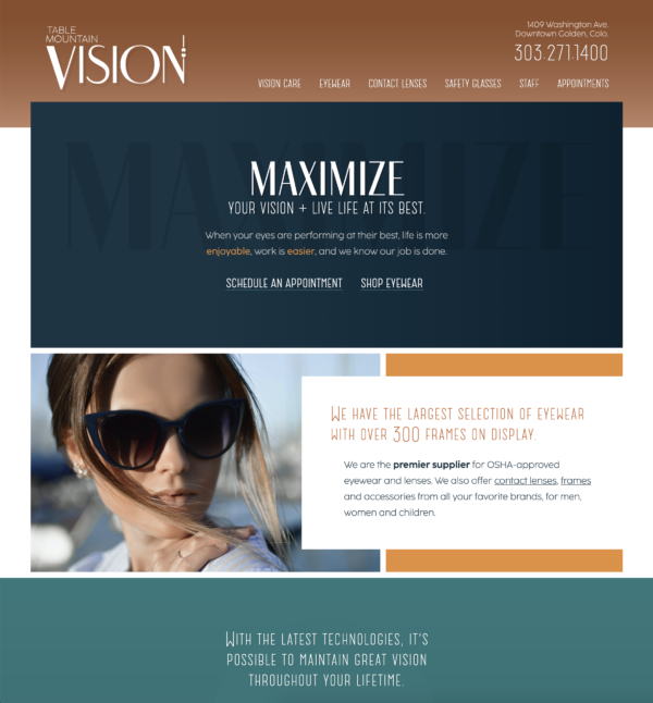
Local Optometry Website Design
Most of the competitors have cold-feeling websites, without attention to detail, that only inspire homeowner confidence with user reviews. We wanted to showcase the unique contrast that Baruch Construction offers: working like artisans, yet fighting like pitbulls with the insurance companies.
We wanted to keep existing logo and colors, expanding upon the brand to carry out a rugged, manly construction look, with strong contrast and colors – yet stay approachable and balanced with a softer, artisan, not-so-in-your-face look, accomplished with more gentle design elements including body font choice, borderless boxes and light shadowing.
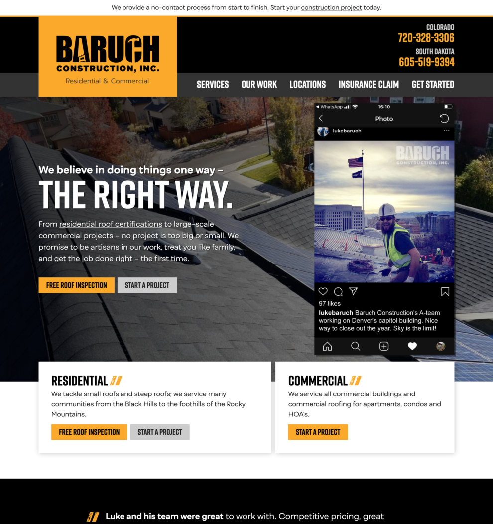
The top part of the homepage answers so many questions. We notice that they are easily reachable via phone, text, and email, with the yellow buttons in the upper right. A lot of worry arises with contractors when homeowners wonder if they will show up to work – this proves you are on it.
We can also see instantly from the navigation that you work with insurance companies and offer free estimates.
The Instagram screenshot is genius in that it shows that they are enjoying work, and they are techy and trendy enough to be using popular software programs. This communicates that they are not a bunch of old guys from Texas showing up to fix your roof. They are cool, young, local Coloradoans earning an honest living. The more obvious advantage of this screenshot is showing off the work on the capitol building.
I love starting out this values-based title. It’s hard to find another construction company doing this. They force you into reviews and contact forms. This feels real and human, and less sales-y.
The background photo is super cool because we are seeing a bunch of rooflines, highlighting that major aspect of your work. People won’t have to think “what does Baruch do” when they are looking at rooflines!
The next block down highlights Residential and Commercial. This instantly says that you can take care of anything for anyone. The white background of the boxes and soft shadows introduce a lighter feeling of organization and obviousness that begins to show how you work: thoughtfully and carefully, yet simply and effectively.
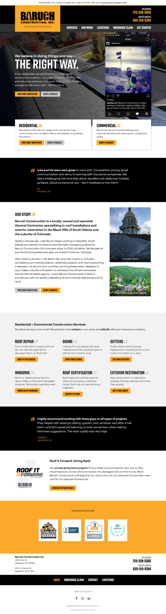
So far this is a good bit of information to take in, so let’s now prove what we’re saying is true with a testimonial. The rest of the layouts are very simple and straightforward, with color indicating a subject change. I’m not usually a fan of an “about” on the homepage, but for your industry it’s very appropriate.
Followed with an outline of the services pages, another testimonial, and highlighting Roof it Forward. We round out the footer with contact info and a repeat of the navigation.
She got down to business!