Before and After: Logos
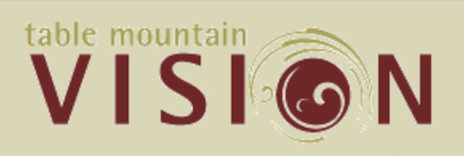
Optometry Logo Design: The logo is redefined to be more useful in that the word “vision” is bigger and clearer, with some contrasting strokes. The typeface is simple, yet intricate, with a modern-retro feel. It’s delicate thinner strokes combined with the strength of tallness is distinguishable and eye-catching. The “o” is open and wide, almost like you’re looking through it. The “n” features an iconic double circle reminiscent of eyeglasses. It’s overly simplified and pattern-like, to give a midcentury modern feel, with the same general layout as before to add familiarity. 2021
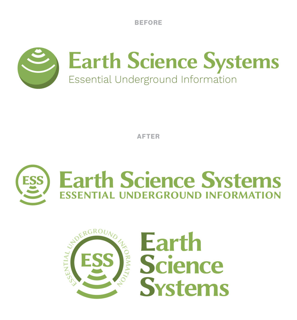
Underground radar logo: Here’s a logo update that doesn’t completely start all over or re-brand, and brings in a designer’s perspective. Keeping the same font, the lettering feels heavier and more deliberate with slight adjustments to width and height. Bringing in an alternate “y” allows the tagline to be placed directly underneath, allowing these elements to be read as one. Some letter spacing on the tagline adds lightness and helps keep the logotype more dominant.
We liked the circle for the globe, and the lines for the radar as in the original concept.
I took a different approach by adding another element. This gave me the opportunity to put the lines into context. It’s appropriate that they are related to the initials, as ESS represents the product creating them. With the ESS added, this icon can now stand alone as a brand element.
To add interestingness and emphasis, the lines extend out of the circle, as penetrating the ground, slightly gaining distance as they go – and the negative space creates an invisible border further highlighting and distinguishing the design element. The right side of the circle also has an optional shadow for dimension.
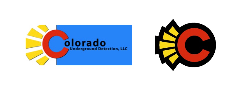
Underground leak detection happens where the sun don’t shine, so I wanted to bring in some much needed black to this logo. Cleaning up the rays so that they’re even, and adding a black background and cutout has made these easy on sign shops, shirt and decal companies for reproduction. The contrast also brings in some sporty undertones to match the company culture. 2018
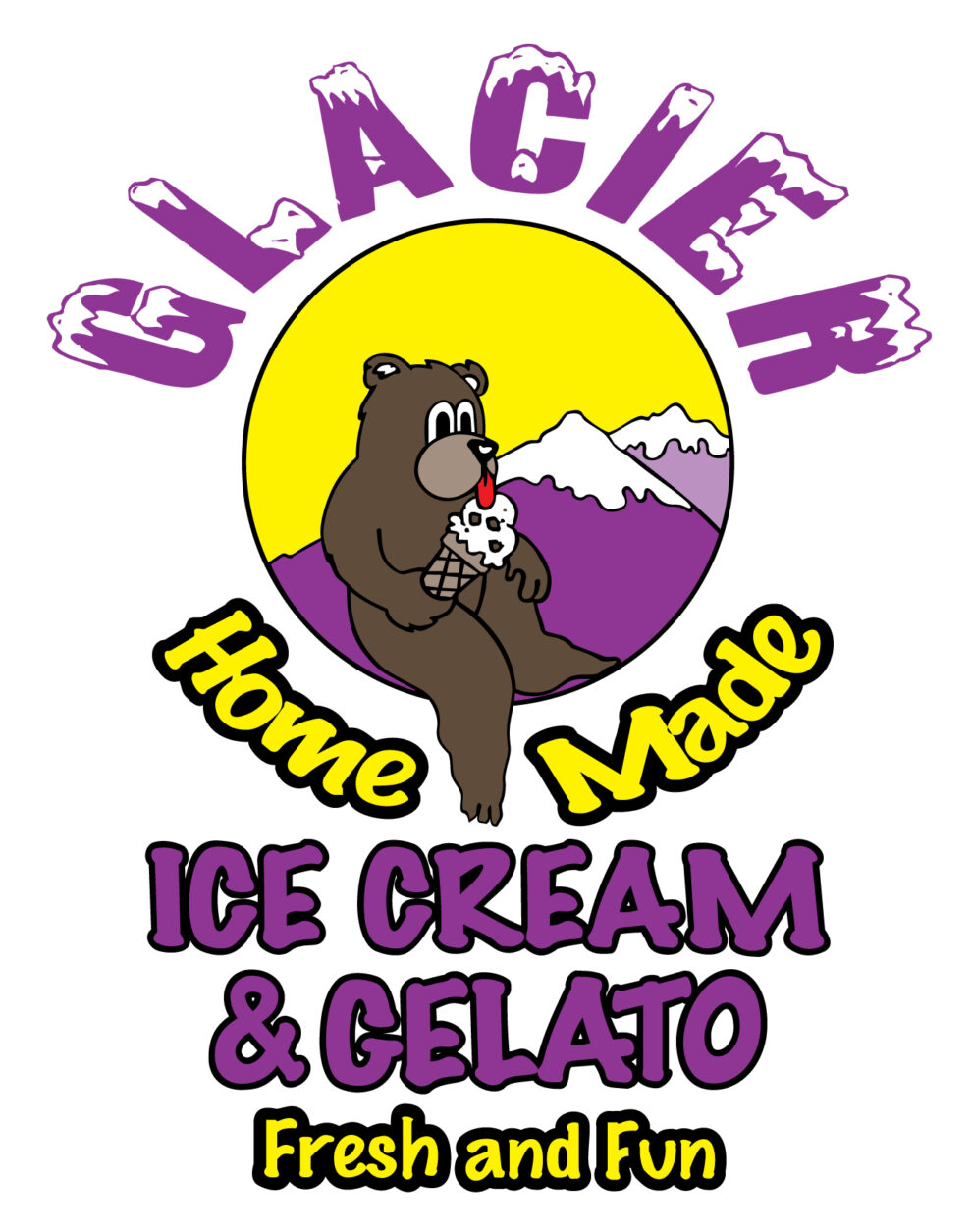
Ice Cream Logo Redesign Above: This franchise allows stores to customize their logo and branding. The left shows the original, and the right shows our personalization – keeping the basic identifying elements and softening the colors. I also designed a Colorado version and a various branding graphics for the store. So fun! 2019
Dog Logo Redesign Above: We wanted a kind, loving and fun style for the new logo, with a woodsy feel, like a carved out sign. Something rustic and imperfect, like the animals. 2017

Real Estate Logo Redesign Above: The logo is simple yet super stylish, with the K bringing in the architectural feeling of the original logo, with a nice type setting, also similar to the original. I love that it’s contained, like your business is contained/constrained by its systems. The typesetting is optically aligned, (not lined up left or right) so we have the feeling of creativity within the lines. 2020
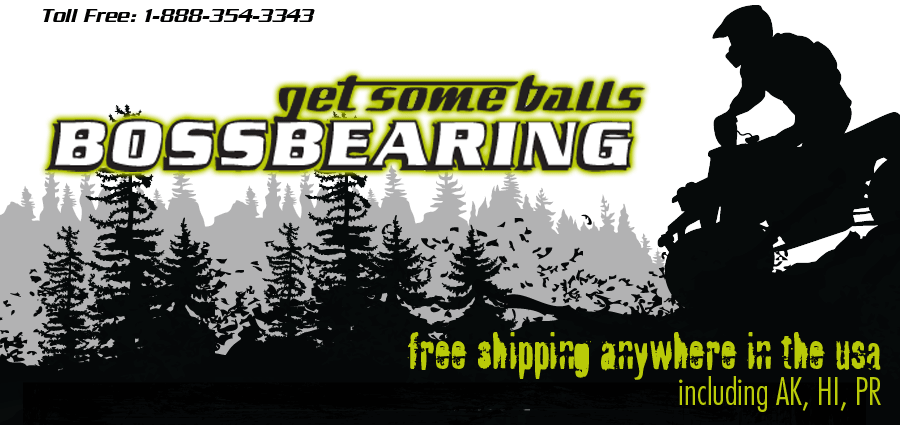
Offroad Logo Redesign/Update Above: Simply re-typesetting and bringing this logo more ‘up-to-date’ looking made a world of difference. We added a ball bearing to help distinguish the two words. 2016