Similar Projects
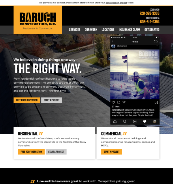
Residential and Commercial Roofing Website Design
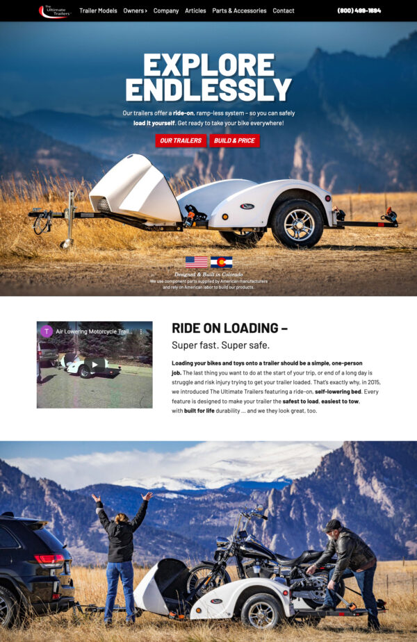
Car and Motorcycle Trailer Company Website Design

Social Media Event Promotion
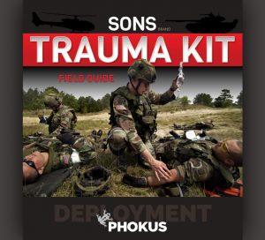
Retail Product Booklet Cover
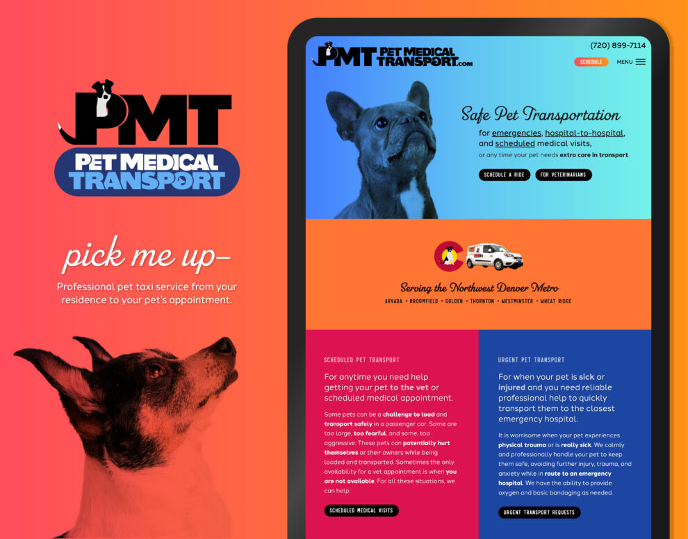
A pet owner to have confidence in that we are transporting a loved one, and taking more than excellent care of their pet;
A mix of looks: for residence pickups we wanted a look that’s uplifting and memorable with lots of personality, yet still professional; for veterinarian transfers we wanted a slightly more clinical look that still reflects the same branding
Overall: We are going for a caring and calming, yet fun and memorable look; that’s confident yet cute; and that can be shifted to a slightly more medical feeling easily.
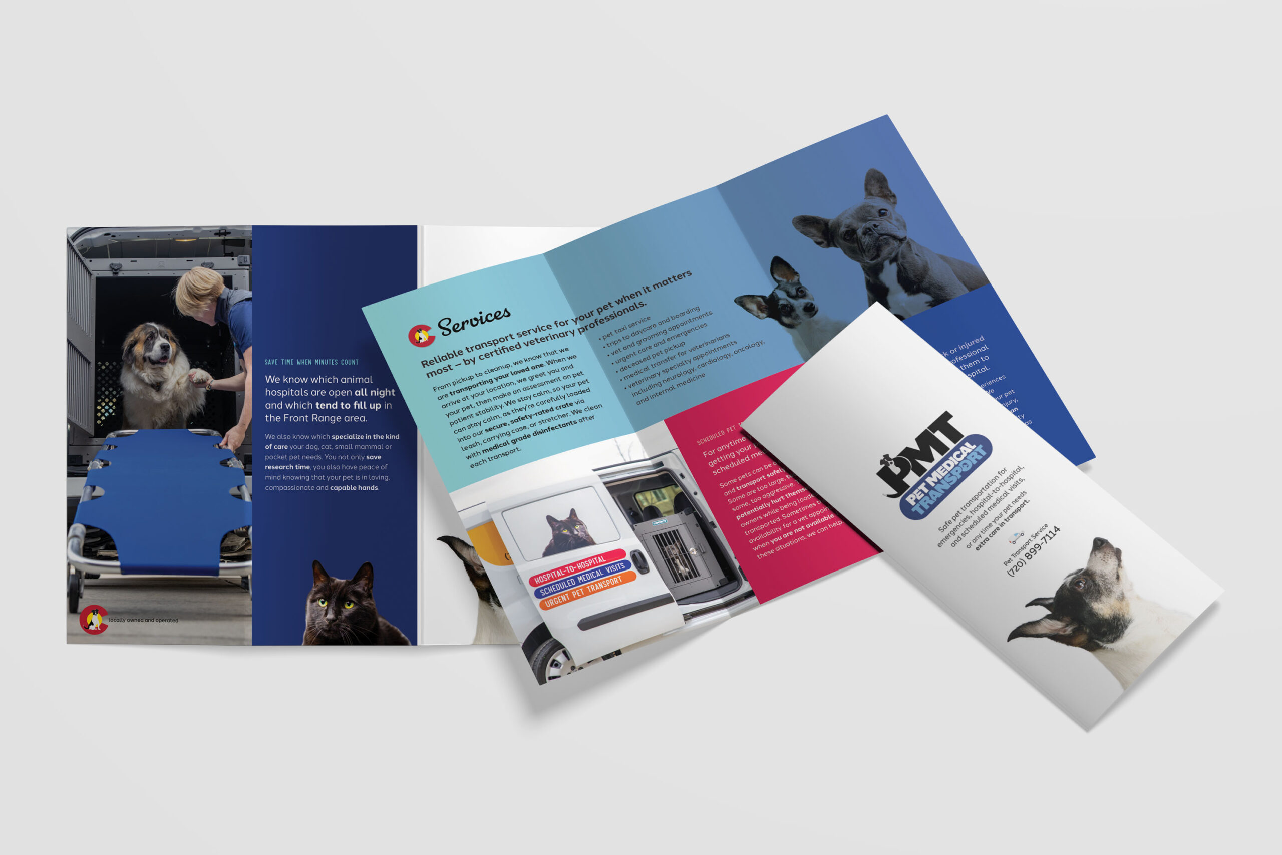
Color: We have bright colors, including orange and sky blue and their coordinating friends. We wanted this to be bold and bright without looking like a sports team, so the gradients help to soften the natural contrast in those colors. Color is also responsible for the energetic feel of the design.
Photography: We continue the professional, strong look, and yet at the same time, this dog’s cute face is begging for attention or to be picked up – a nice contrast to show tenderness and compassion when your brain thinks “awwww.” He blends in with the background for additional attitude and style. Easy to reproduce in print, more difficult to build on a website, so we instantly jump into the “custom” look.
Fonts: Coupling that with the main fonts, we have a personable, fun, and slightly retro-feeling script headline font that reminds me of the pet’s name engraved on an identification tag. Our secondary accent font is featured on the buttons, adds contrast and also resembles ID tags – it also has a clinical feeling in it’s strictness of stroke weight and equal heights.
The body font coordinates in a way that bridges the gap between these contrasting styles to create a recognizable brand. Each letterform has a slight bit of style – enough to be distinguishable and still very legible. Slightly curved letters like the lowercase t and l, help to give the text a feeling of forward movement and friendliness.
We have a solid blocky all-caps font, with a hint of playfulness in the overlapping of the letters. The P turns into our iconic element with the dog’s head and tail, like she is excitingly awaiting pickup at the front window of her residence. Simple enough to be reproduced, with enough style to be recognizable. The lettering for “Pet Medical Transport” carries out the same style with overlapping to make the characters more interesting and feel like they’re coming to life. There’s also a silhouette in the “o” to show the animals traveling.
Truly a God-send for our business!