Similar Projects
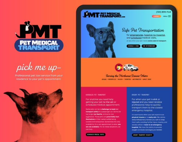
Pet Taxi Branding and Website
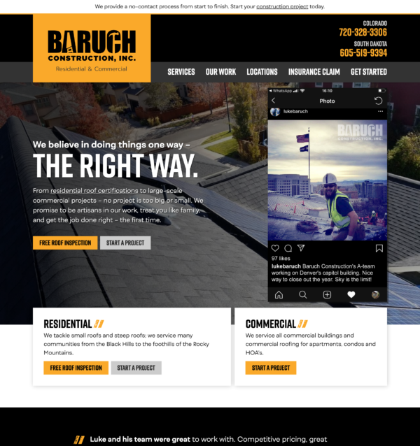
Residential and Commercial Roofing Website Design
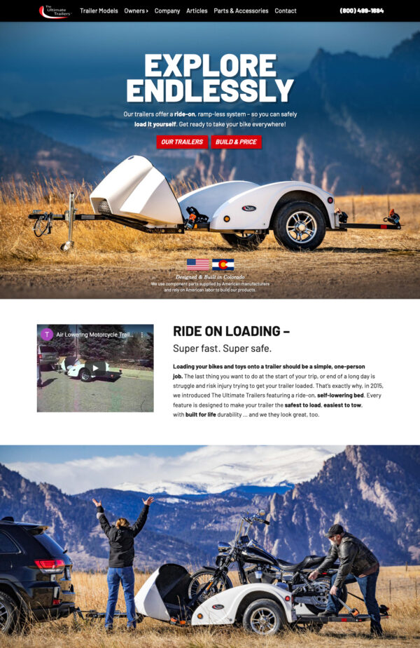
Car and Motorcycle Trailer Company Website Design

Social Media Event Promotion
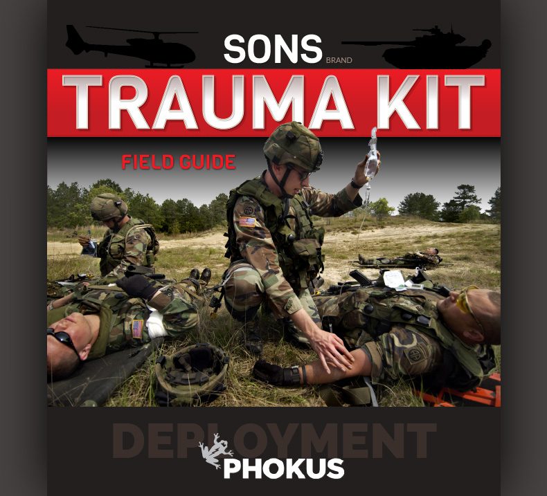
The retail product booklet cover is an important part in the retail chain. First impressions are key and can make or break a decision to buy the product.
The red highlights are set on top of a dark background to show a sense of attentiveness and urgency. A bold photo, overlapping the title gives the design some dimension with a “less is more” strategy.
A professional branding agency works with you to set your brand’s tone for your retail products, your website, and your marketing efforts.
Sarah sets the standard in graphic design by not following the pack. Refreshing.