Similar Projects
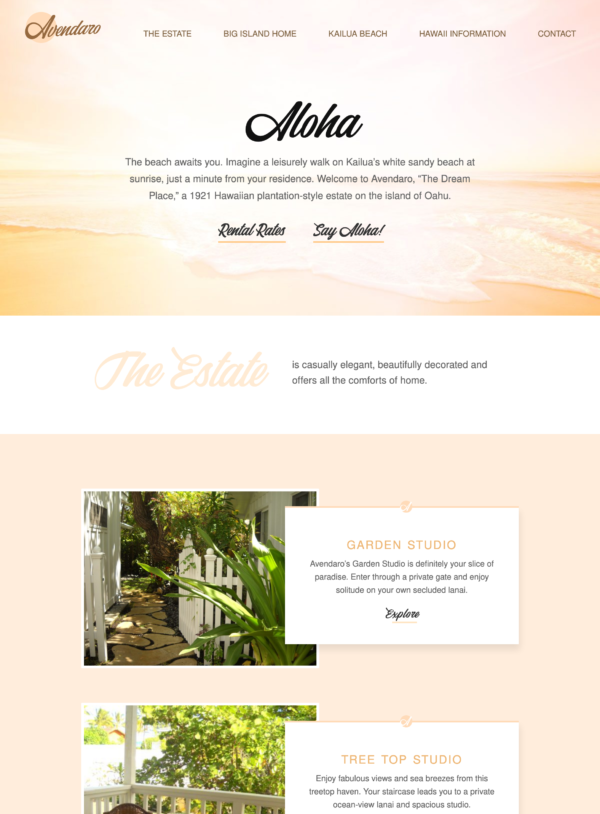
Beach Property Website Design
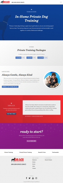
Dog Training Website Design
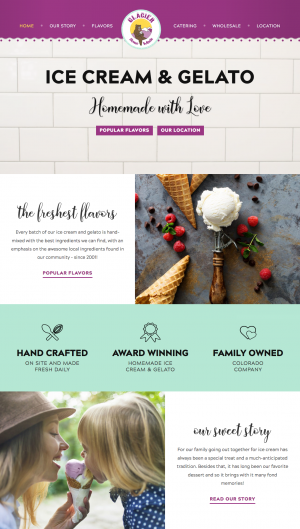
Ice Cream Shop Website Design
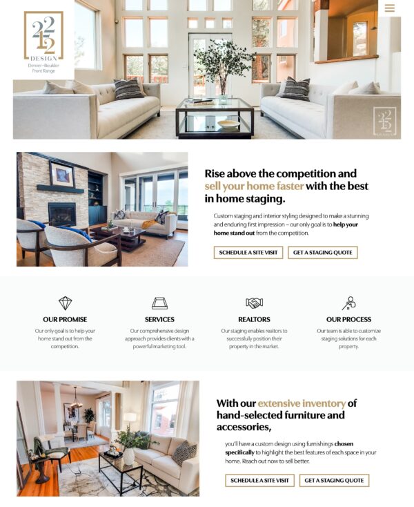
Staging Services Website Design
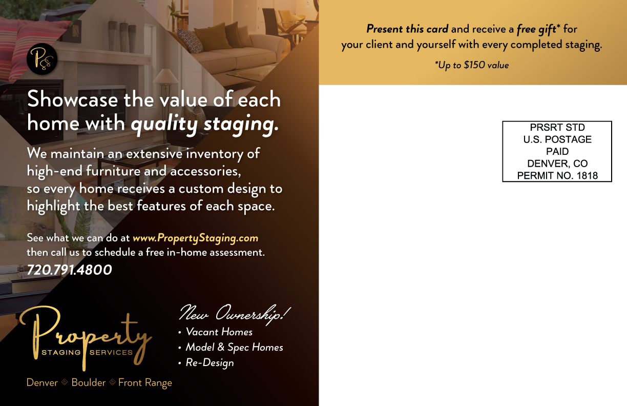
Project scope: A double sided postcard to mail to potential clients
Client wanted: Something simple and stylish, with a focus on space, organization. A design that gives the photos scale and purpose.
Design discussion: Our key photo is slightly layered to give it a magazine-style look. A faded background gradient helps the white letters stand out beg to be read. The somewhat intricate typeface has a uniqueness about it, and the lowercase g’s help form some rhythm in reading the first line. The script typeface contrasts the sans-serif, putting the word “valuable” into the setting (thereby making this house look more valuable), while encouraging you to turn the card over. Every design element pays special attention to placement and detail combined with an overall look that’s simple and stylish.

Nailed it! Sarah, you listen so well that you created the essence of ME in pixels and code form.