Similar Projects
Marketing Digital Graphic Design

Free Shipping Advertisement
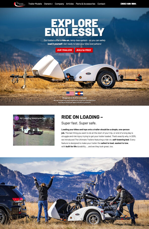
Car and Motorcycle Trailer Company Website Design
Offroad Website Design
The logo boasts an overall bold, sporty look to attract offroaders. The thick typeface says sturdy, boxy, rugged, while its imperfections soften the boldness so it’s not too masculine. The green leaf peeps the idea that the products are made from recycled materials.
I love how you put your all into your work. Thank you for your expertise.