Similar Projects
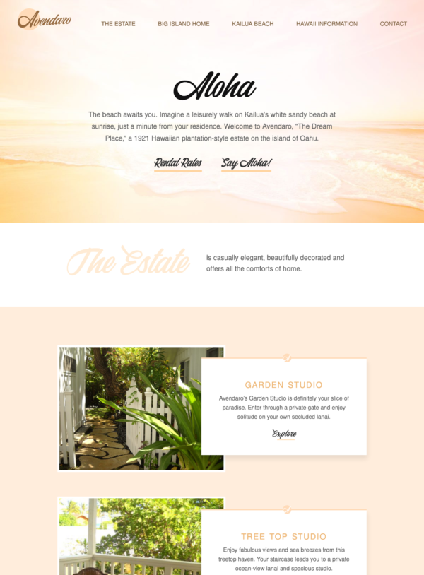
Beach Property Website Design
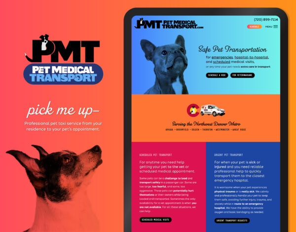
Pet Taxi Branding and Website

Postcard Mailer Design
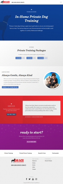
Dog Training Website Design
![]()
The “M” is drawn from a handwriting sample which ignores the boundaries of the outlined circle-grid, hinting at their use of cutting-edge technology. The background, layered with circles, gives the logo dimension and allows for a good contrast of color and a sporty look.
This sporty handwriting logo design is used for business cards and company identity items.
Thank you for being such a pleasure to work with.