Similar Projects
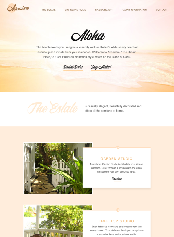
Beach Property Website Design
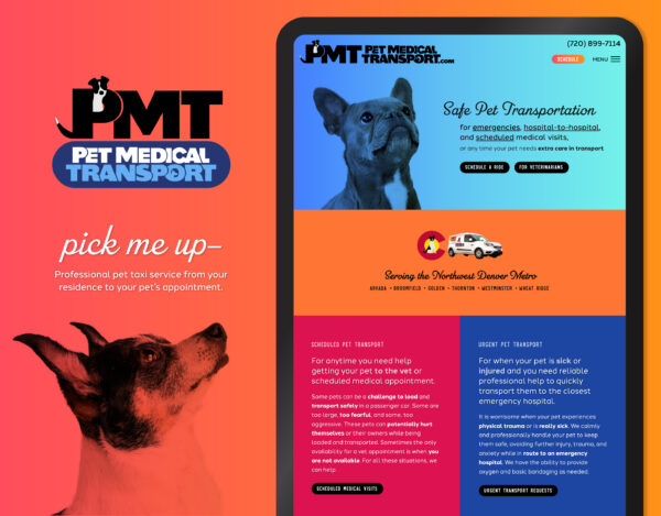
Pet Taxi Branding and Website

Postcard Mailer Design
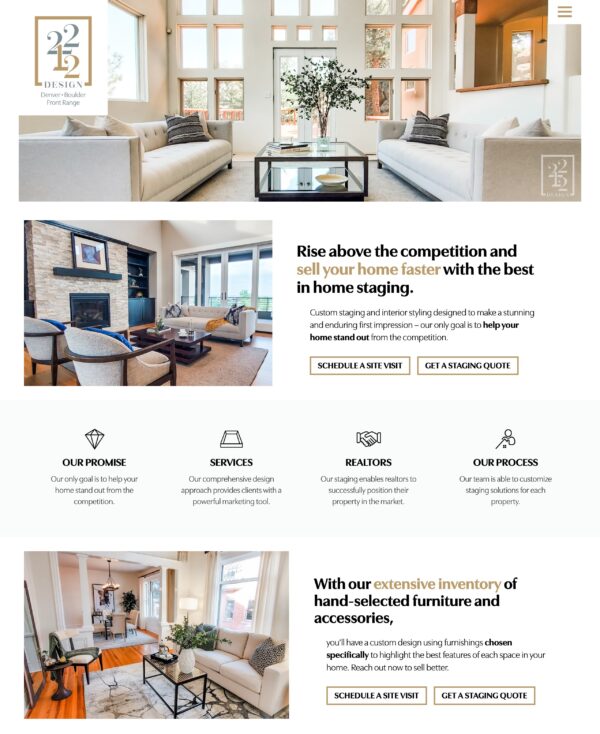
Staging Services Website Design
![]()
The “M” is drawn from a handwriting sample which ignores the boundaries of the outlined circle-grid, hinting at their use of cutting-edge technology. The background, layered with circles, gives the logo dimension and allows for a good contrast of color and a sporty look.
This sporty handwriting logo design is used for business cards and company identity items.
Nailed it! Sarah, you listen so well that you created the essence of ME in pixels and code form.