Similar Projects

Product Box Enclosure Designs

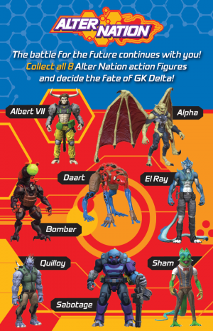
Social Media Advertisement Design

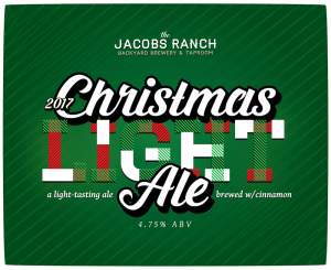
Beer Label Design

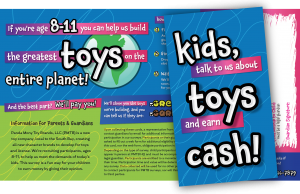
Printed Direct Mail Design
Project scope: A custom WordPress theme that matches her food truck. I worked with her existing graphics, developed it further into professional branding, and translated sign shop graphics to the web.
Client wanted: A clean, functional design that matches her food truck and to create appropriate web-based graphics to further her branding.
Design discussion: Showcasing her existing logo, the sunburst gives the feeling of a food truck in motion. Shades of red capture the feeling of the truck in the bright Colorado sun, while the marker-style font implies home cooked, just like grandma’s.
Visit Cyndy’s Food-Lish-Us | https://foodlishus.com/
Sarah sets the standard in graphic design by not following the pack. Refreshing.