Similar Projects

Marketing Digital Graphic Design

Free Shipping Advertisement

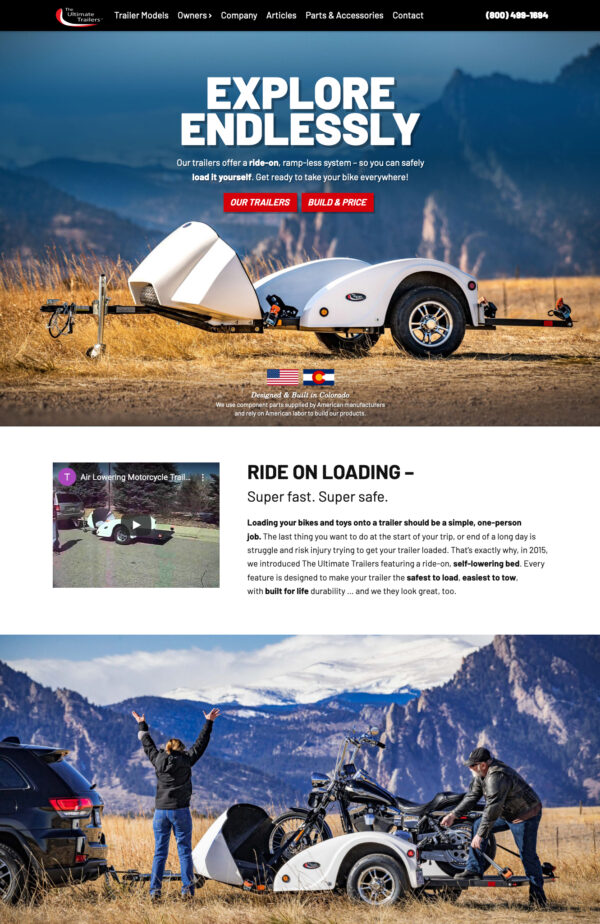
Car and Motorcycle Trailer Company Website Design

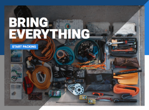
Offroad Website Design
Rock-It Man’s bold approach to testing and design shines through in their website. Photo-intensive pages prove that there’s no limit to what their rockers and bumpers can stand up to. In 2006, this site along with the company logo were awarded an American Graphic Design award for excellence in communication and graphic design.
Rock-It Man’s offroad fabrication company website design is definitely dated for today’s web standards, but is one of my favorites for pushing the design limits of the web and browser display.
P.S. I leave this here to remind us all how far HTML and CSS design have progressed. This website was designed in tables with system fonts and many layers of graphics in a Photoshop file!
Sarah is the best! Great design backed by expert know-how on how to make it all work online!