Similar Projects

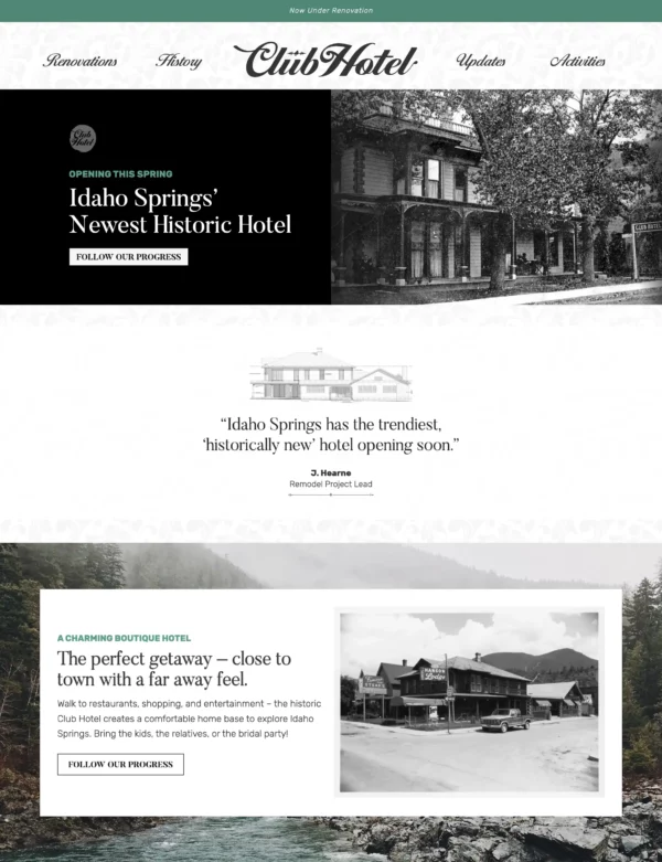
Boutique Hotel Branding

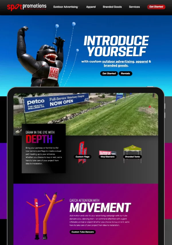
Outdoor Advertising Website Design and Branding

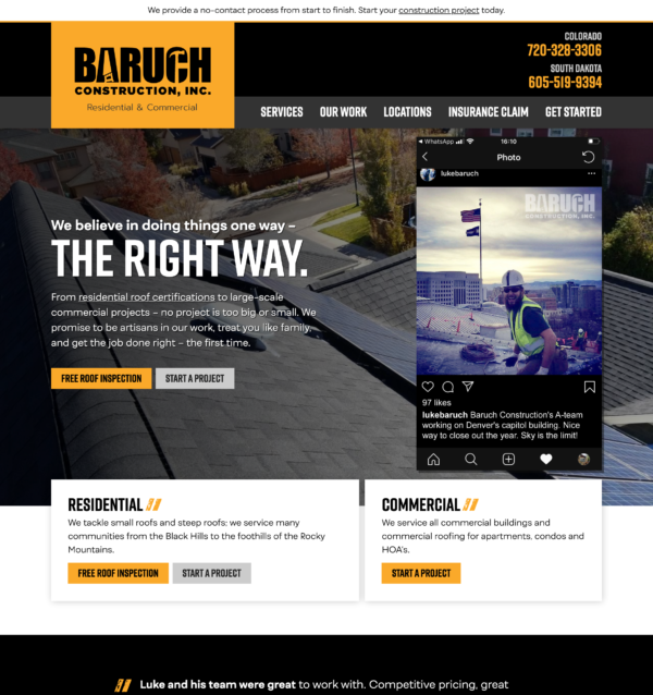
Residential and Commercial Roofing Website Design

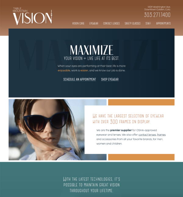
Local Optometry Website Design
Project Deliverables: Branding, logo, custom design & WordPress theme, business cards, custom jar grippers, flyers
Client wanted: Simple, organized, professional but not boring, a touch of “quickbooks” feeling, with a push-and-pull play on a solid “bookkeeping” look and an organic healthy look.
Design Discussion: A serious, clean sans-serif is paired with a handwritten typeface for maximum contrast, to bring in the organic feel that we’re after. Throughout the page, we play with the back and forth of this idea to say that we’re strict about our books, yet continually personalizing it.
If you are sick of slick designers overwhelming you with lingo and ludicrous pricing…you need to SW33Ten your experience with Sarah!