Similar Projects
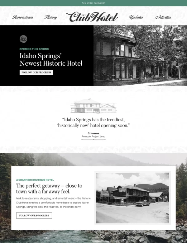
Boutique Hotel Branding
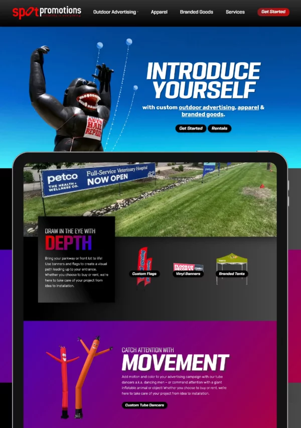
Outdoor Advertising Website Design and Branding
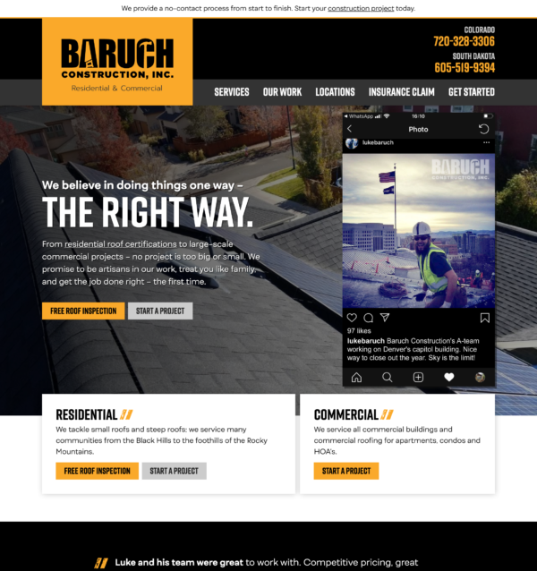
Residential and Commercial Roofing Website Design
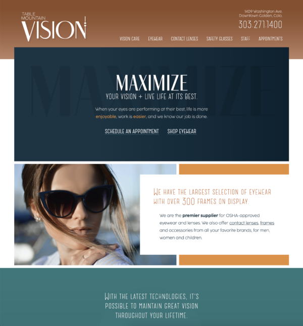
Local Optometry Website Design
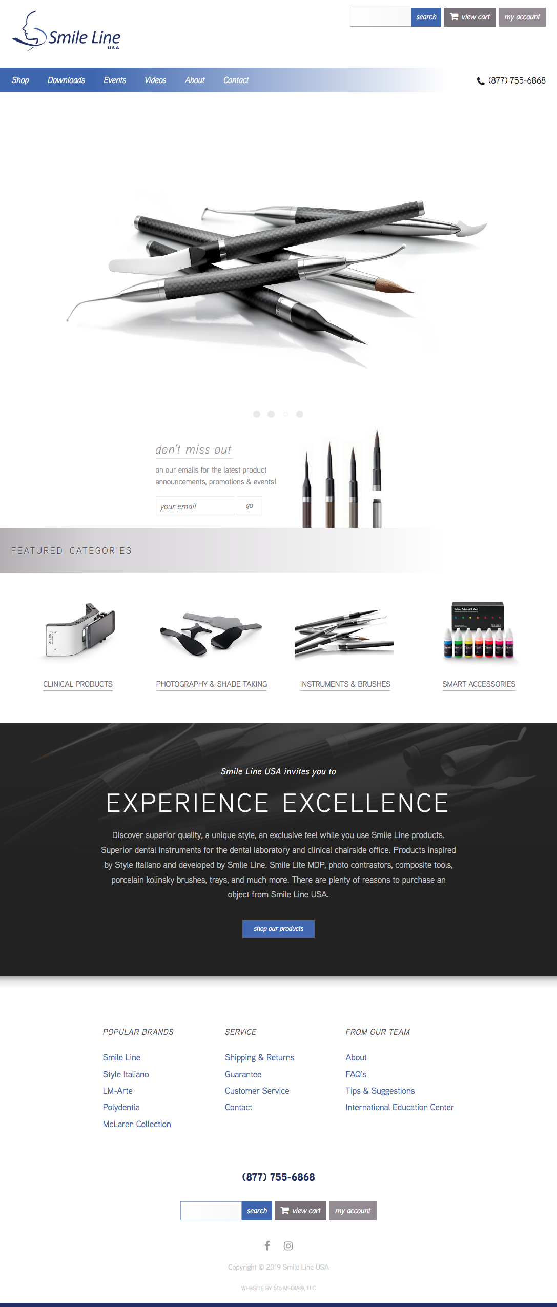
Project deliverables: website design, custom WordPress theme
Client wanted: a simple, elegant, sleek design to showcase their products.
Design discussion: Since the products have a lot of contrast, they paired well with a white background. Shades of gray help to create hierarchy and sections, while pops of blue draw in the eye for the navigation and call to action buttons. This is a collaboration website with another development company, where I designed and developed the main site, and they developed the shop.
Live website: https://smilelineusa.com
Truly a God-send for our business!